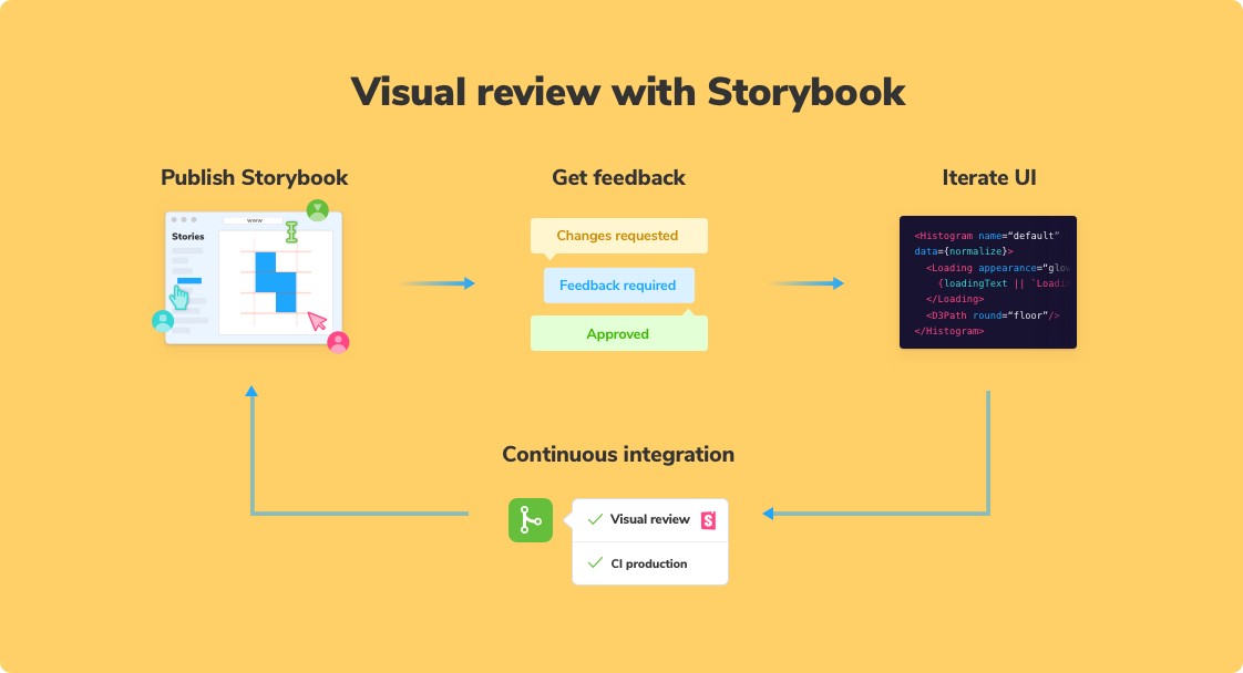
Visual review in Storybook
How to sync development and design with visual review
If you’re an experienced developer, you probably rely on code review to ensure that contributions to the codebase are up to the team’s standards. Committing code without review allows mistakes and inconsistencies to creep in. The end result is a brittle code base.
What about your user interface?
Every time a design is implemented, a series of small design decisions is made along the way. No design is ever “complete” so devs end up making visual contributions to the “UI codebase” that fill out missing design details. Should you commit these UI changes without review?
UI development combines code and graphics. Let’s see how to make visual review a more explicit part of the UI development workflow. We’ll explore how the cutting edge teams integrate visual review into their process.
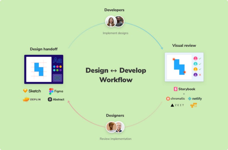
Design handoff vs visual review
Design handoff describes the literal handoff of a designer’s static images, prototypes, and specifications to a developer. It’s a lossy process though.
Details get lost in implementation –especially when there’s a tight deadline. Handoff tools like Zeplin, Abstract, InVision, etc aim to ensure those details make it to production. But even with the best design handoff tools, unexpected hiccups and edge cases inevitably surface during development that impact the design.
Frontend development naturally flushes out details that were overlooked in the design process. Visual review is a collaborative process that comes after development. It helps developers accomplish three tasks:
- Ensure the UI implementation meets the design spec
- Troubleshoot technical hurdles that require designs to change
- Confirm new states introduced during development
Why now?
Modern UIs have countless UI permutations built by innumerable stakeholders spread across distributed teams. As teams grow to build ever more complex UIs so too does the communication overhead required to keep everyone in sync. It’s no surprise, then, that research-backed studies indicate devs spend on average 72 minutes a day collaborating.
Establishing a visual review workflow helps streamline UI collaboration to prevent annoying rework, miscommunication, circular discussions, and endless meetings.
UIs have thousands of states that must be created, maintained, and reviewed by more stakeholders than ever.
How to setup visual review
Teams reach consensus on UI implementation by pairing git-powered automation with a human-centered workflow. Previously, I wrote an in-depth guide and article on how folks at Squarespace, Major League Soccer, Apollo GraphQL, and more deliver UIs to millions of people. Here’s a summary.
Build UI with components in isolation of the app
There’s a continuum of discrete use cases in apps today. React, Vue, and Angular help reason about these use cases by decomposing UI complexity into components. Teams use Storybook to create, maintain, and test UI components in isolation of the app. That removes annoying distractions like incomplete business logic and flaky APIs.
With Storybook you naturally document the salient use cases as “stories” so that you can revisit UI states during visual review and later during QA.
Establish a shared workspace for UI implementation
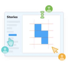
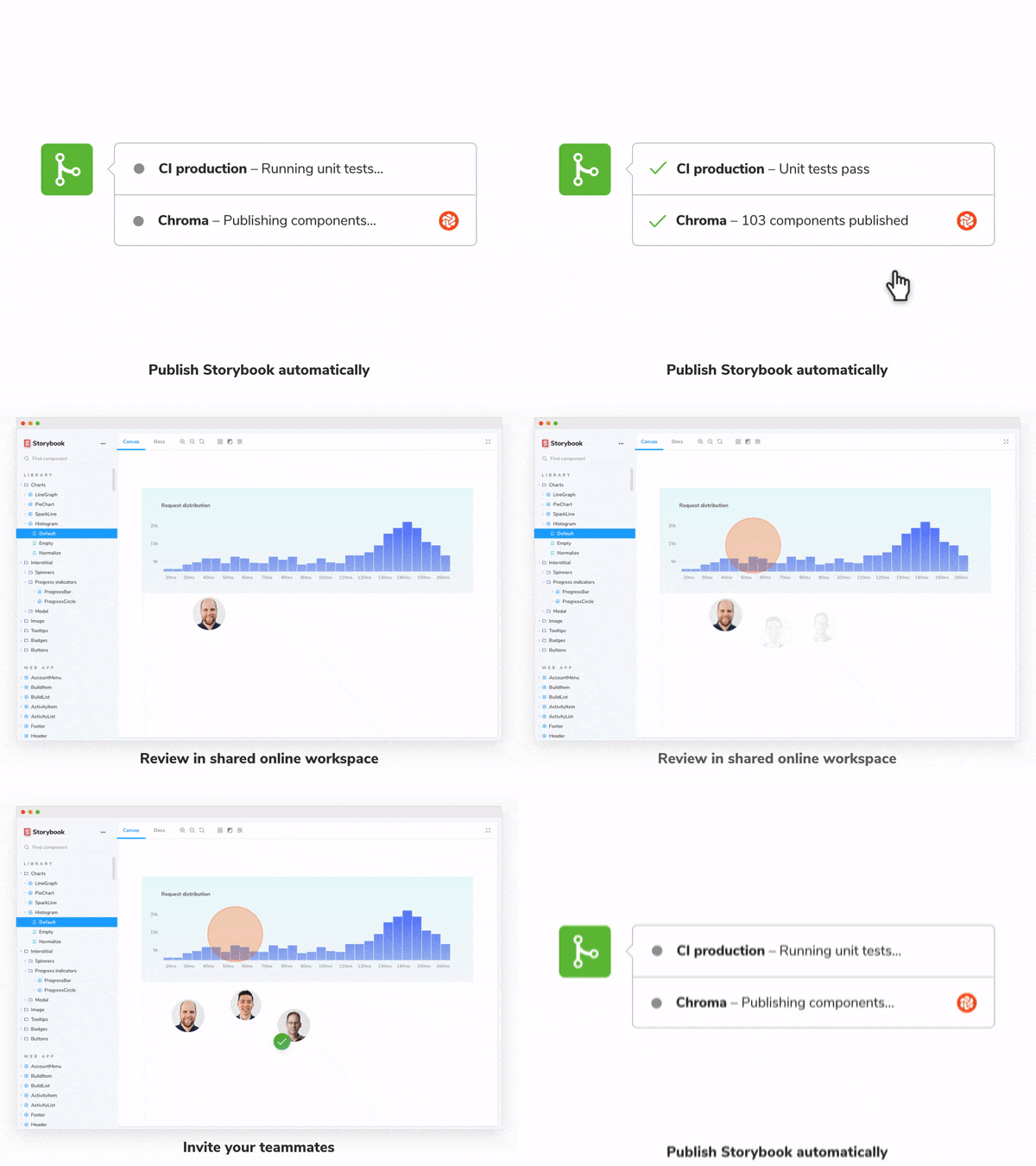
A shared workspace is a place online where stakeholders can verify the live UI implementation from the comfort of their own browsers. The workspace is updated every commit with the latest UI code to make sure stakeholders reference the exact same artifacts when reviewing.
In the past, teams would have to maintain local dev environments to verify UI implementation — or worse, pass around screenshots. Now you can link your team to the live UI to get feedback instantly.
Learn how to set up a shared workspace with these tutorials: Export Storybook as a static site, Deploy Storybook and review design systems online.

Consolidate feedback in a task tracker
Once everyone is recording the expected use cases as “stories” and reviewing the latest work-in-progress, it’s time to request stakeholder review.
Mistakes are an inevitable part of developing apps. Most mistakes are caused by miscommunication rather than technical flaws. The visual review workflow should create space for constructive feedback and troubleshooting.
A common practice is to assign an issue in the task tracker with links to the living UI implementation. That centralizes discussion to simplify keeping track of complicated change requests. What’s more, it creates a digital paper trail to trace how decisions are made.

1. Publish Storybook online when you push code to a web host. This gives your team an up to date reference point for UI without needing to mess with a local dev environment.
Set this up using the “deploy preview” feature common amongst web hosts like Netlify, Now, Heroku, and Surge. Alternatively, you can configure your CI provider (e.g., CircleCI, TravisCI) to deploy to a static web host (e.g., Amazon S3, Google Cloud Platform).
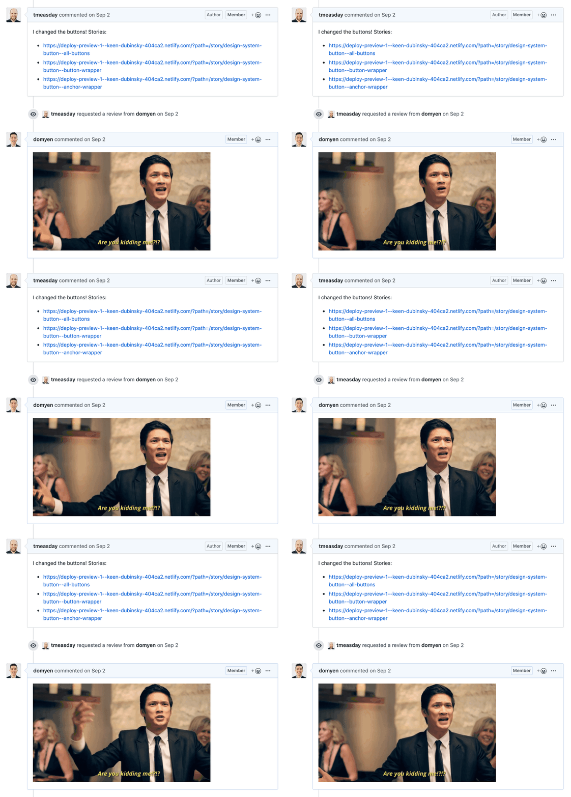
2. Request feedback in task manager. Navigate to your Storybook online and note the URLs of the stories you’d like feedback on. Then create a task and paste those urls with any additional context you’d like to add — you can also piggyback on an existing tasks. Next assign or mention the relevant PMs, designers, and QA.
Here’s an example of a team that uses GitHub’s pull request page to assign reviewers and gather feedback.
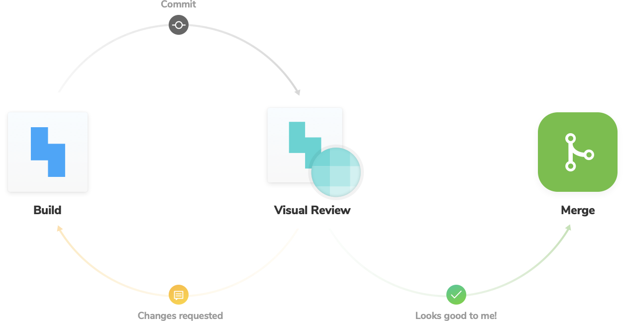
3. Iterate UI to address feedback. Now that you have the feedback from the previous steps, it’s time to make changes to the UI code to address concerns. When you update the UI code and commit the system will automatically publish your updated Storybook online (step 1). From there, repeat the feedback process (step 2) to resolve any remaining issues.
Conclusion
Visual review is a developer-oriented process for gathering feedback on UI implementation. This article synthesizes best practices into a workflow that solves for ergonomics, automation, and pragmatism — let it be a starting point for your interdisciplinary team.
At Chroma, we’re so convinced about the benefits of visual review with Storybook that we created a dedicated tool that makes the above workflow easier and more natural for your team. Check it out.